Project Breakdown
Goal:
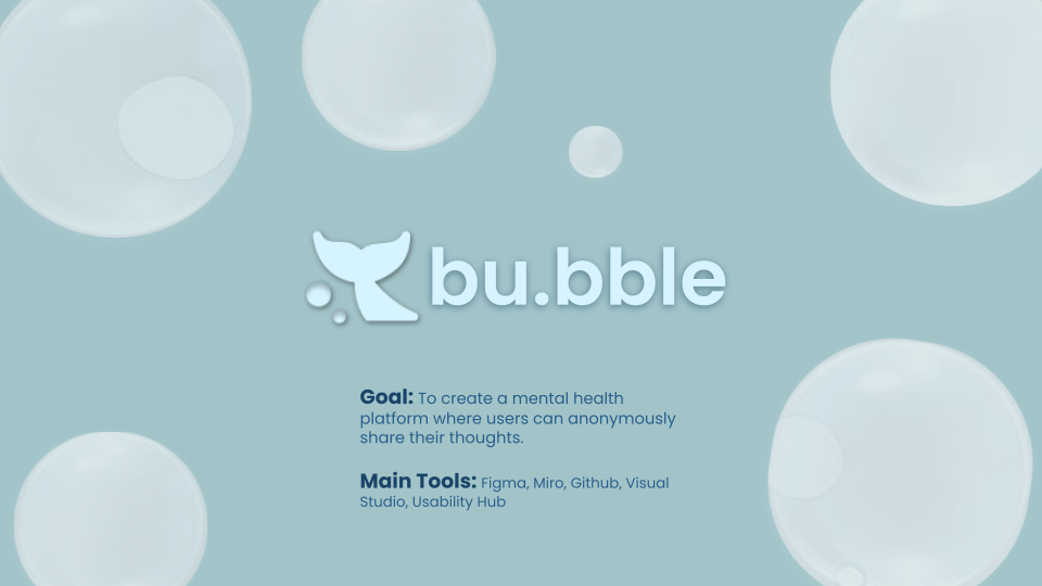
To provide a mental health platform where users can anonymously share their frustrations as well as other personal thoughts. Bubble provides a safe private space where users can seek help from mental health care professionals and find activities that help relieve their stress.
My Role:
I developed the app prototype and conducted user research and testing. I also made the application's promotional web page.
Timeline
~ 3 Weeks
Prototype
https://www.figma.com/proto/lWrGmtelqovdds5zSczbFv/Project-3_Group-8?node-id=333%3A1785&starting-point-node-id=333%3A1785&scaling=contain
Final Prototype Interactions Recording
Preface
Social media is used by 4.48 billion users (Dataportal, 2021) and facilitates the sharing of ideas, thoughts, and information through the building of virtual networks and communities (Investopedia, 2021).
Social media has had an averse effect on mental health with reported symptoms of major depression increasing by 52% from 2005 to 2017 (Etactics 2020).
Problem to Solve:
With the popularity of social media applications focus was placed on two main areas:
1. Privacy: Will my identity be protected and thoughts and feelings remain private?
2. Safety: Am I safe to share the way I feel without being judged?
Research
Proto Persona:
Initially a proto-persona was created, a persona based on our assumptions.Cecillia, is a millennial working as a compliance officer. She’s constantly stressed, but she finds there’s no place online where she can share her feelings without worrying about being judged. Additionally, she’s too busy to seek mental health professionals’ help and her inferior complex from is getting worse day by day.
Based on this persona a solution would provide:
1. A social media application where users post anonymously.
2. A place where users can be 100% genuine without worrying about being judged by others.
3. Users can see what others are going through as well.
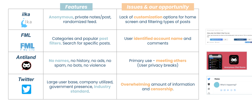
Competitor Analysis
Ilka and fml are companies which are direct competitors that allow users to post anonymously and allow users to view others posts.
Indirect competitors are Antiland and Twitter. These apps are primarily used for social interaction and focus on social features or privacy options.
Interview Process
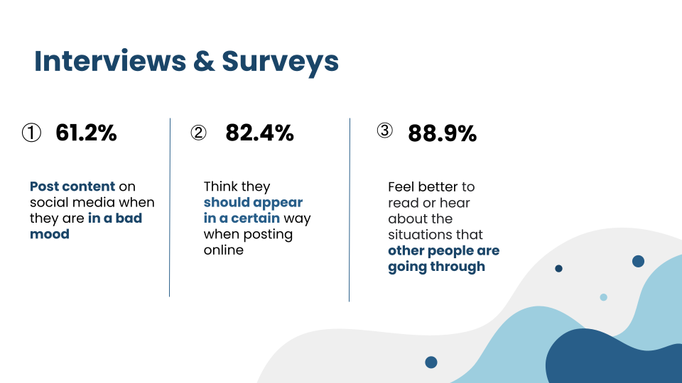
Through our initial round of interviews and surveys we noted that:
Around 61% of interviewees post comments on social media even when they are in a bad mood.
82% worry or are self conscious of the image they portray on social media and feel they should worry about the way they appear in a certain post or comment
89% felt that having the ability to read or hear about what others are going through allowed themselves to empathize and to recognize that they may not be alone in what they are experiencing
Research Findings
Problem Statement
The interview data helped formed the problem statement:
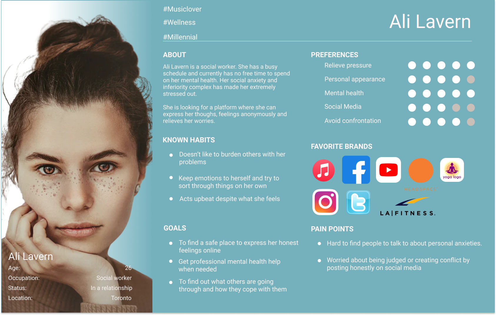
“There is currently no space where people can freely speak about their problems, issues and feelings without fear of judgement or implication.”User Persona
Ali is a 26 year old social worker who likes to keep her emotions to herself and act as if she is a confident socially outgoing individual.
Ali has social anxiety and feels constant stress from work and worries. She spends much of her time on social media, and needs to find a safe place online where she can freely share her thoughts without consequence a place where can read about similar situations. A platform to help relieve stress without worrying about how she is perceived and feels the need to act a certain way when posting on social media to avoid offending people.
User Insight
“Ali, a millennial with social anxiety and constant stress, who spends much time on social media, needs to find a safe place online where she can freely share her thoughts without consequence and can read about similar situations from others to relieve stress because she worries about how she is perceived and feels the need to act a certain way when posting online to avoid offending people.”
Survey Data
User Persona
Determining App User Flow
Brainstorming
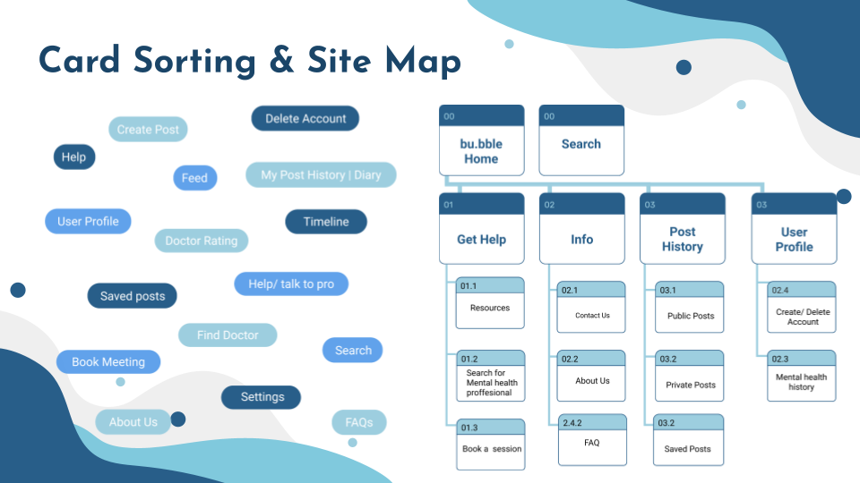
Various ideas and features were brainstormed to create various "idea cards".
Idea/Feature Prioritization and Site Map Creation
Ali needs a quick way to release her emotions but remain anonymous as she does it. She needs a place to speak openly without fear of judgement, misunderstanding. She does not want to implicate herself at work or in her personal relationships with what she posts online.
Important features and functions to have in our app were brainstormed and narrowed down during card sorting.
The sitemap consists of these main sections:
The home feed, the "Get Help" section (medical), a product info page, a post history page and user settings.
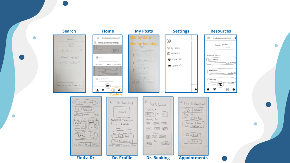
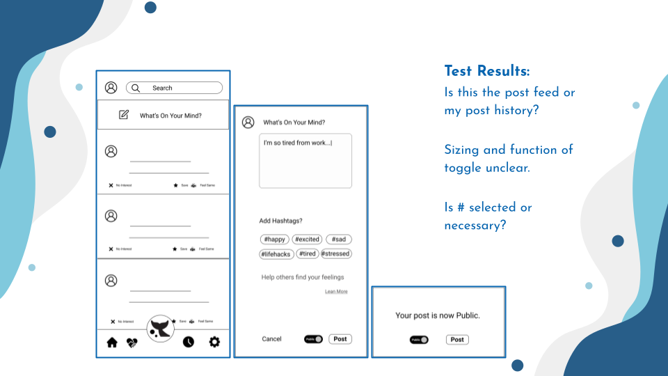
Low Fidelity Prototype
Also below are screens of the home feed, the pop-up when composing a post, and the pop-up when the post is ready to be published.
Users were asked to navigate through the prototype and create a private post.
The main takeaways from testing were that the feed on the home page could be confused as the users' own history, the hashtags were not very intuitive because the users weren't sure if it was necessary to add them and that visuals could be more clear throughout.
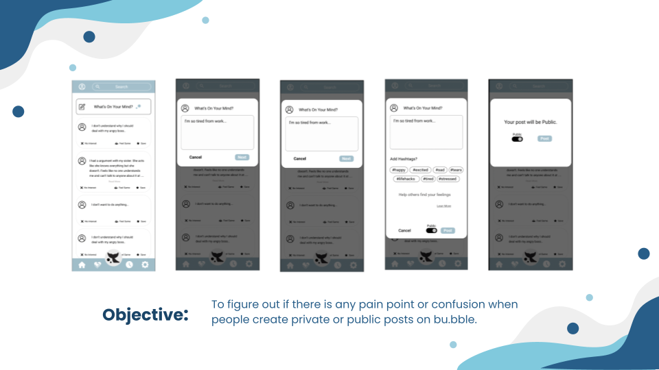
Mid Fidelity Prototype and Testing
During mid-fi testing, the main goals were to test if users are able to create a private or public posts, to test the usability of adding hashtags as well as a notification system for posts.
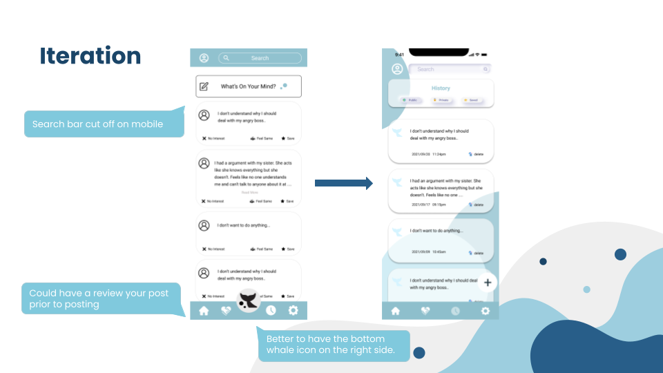
After conducting user tests, the design was iterated upon based on user feedback.
For example, in testing the search bar section was cut off on mobile, and the post icon would be more clear if it was placed on the left side. Additionally, users expressed that they wanted to see their prior posts.
A history page was created for users to view public, private posts as well as saved posts from other users.
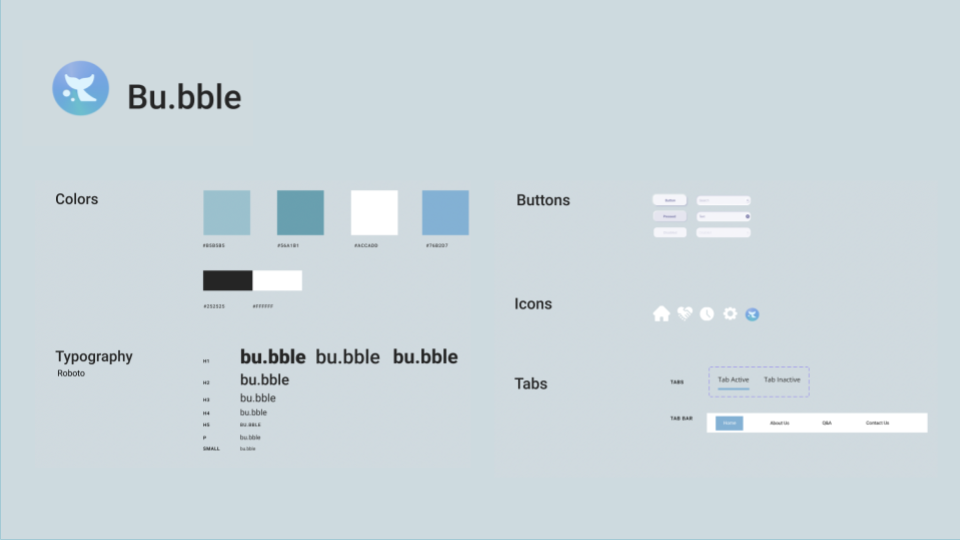
Style Guide
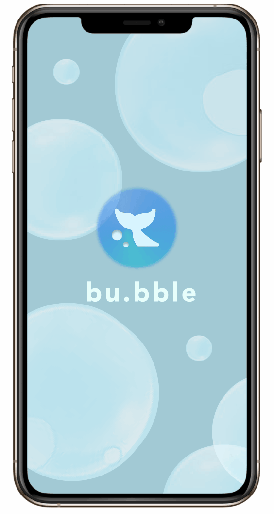
A light blue color scheme was used to simulate a calm and stable environment for users. The goal was to have users feeling relaxed and safe at all times. This style guide was developed when creating the second prototype.
High Fidelity Prototype
Modifications
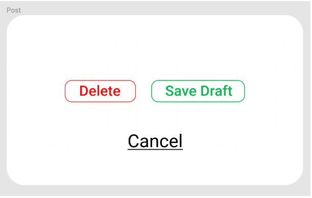
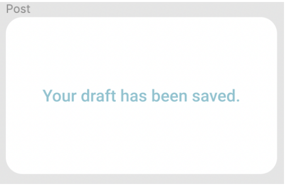
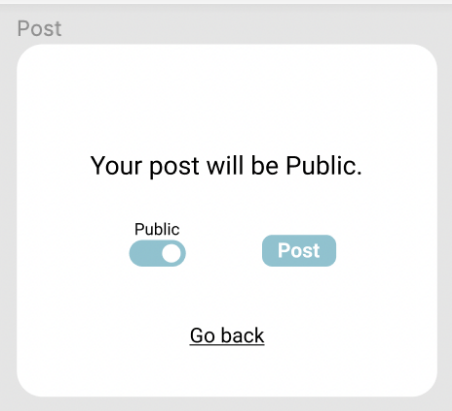
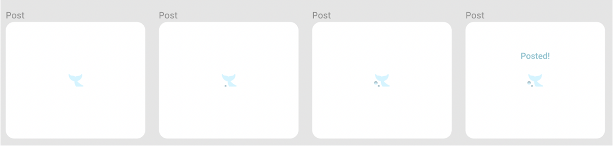
For the latest prototype, popup notifications to better convey post information.
These include:
1. Ask if it’s okay to delete the draft post.
2. A message that confirms that the draft has been saved for the post.
3. Added a “ Go back” button so that users can edit the content.
4. Added a loading popup and animation.
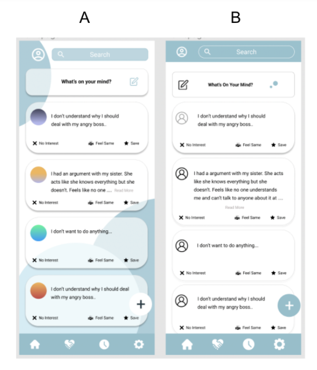
A/B Testing
Version A and B were tested to compare background visuals and color palette. Preferences for the the posting section layout was also tested. To ensure additional feedback users were required to leave comments on why they picked one version over the other.
Following testing it was found that the colour wasn’t distracting and that the posting icon should be aligned to the right to be easier to locate.
After looking at the user data Version A was chosen.
Final Prototype
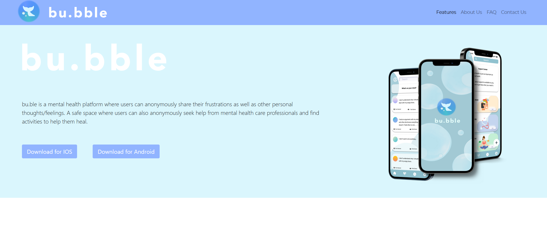
Promotional Website
A mock promotional website was created to showcase the app.
The site summarizes the main features, answers commonly asked questions and has a contact section for those with further inquiries.