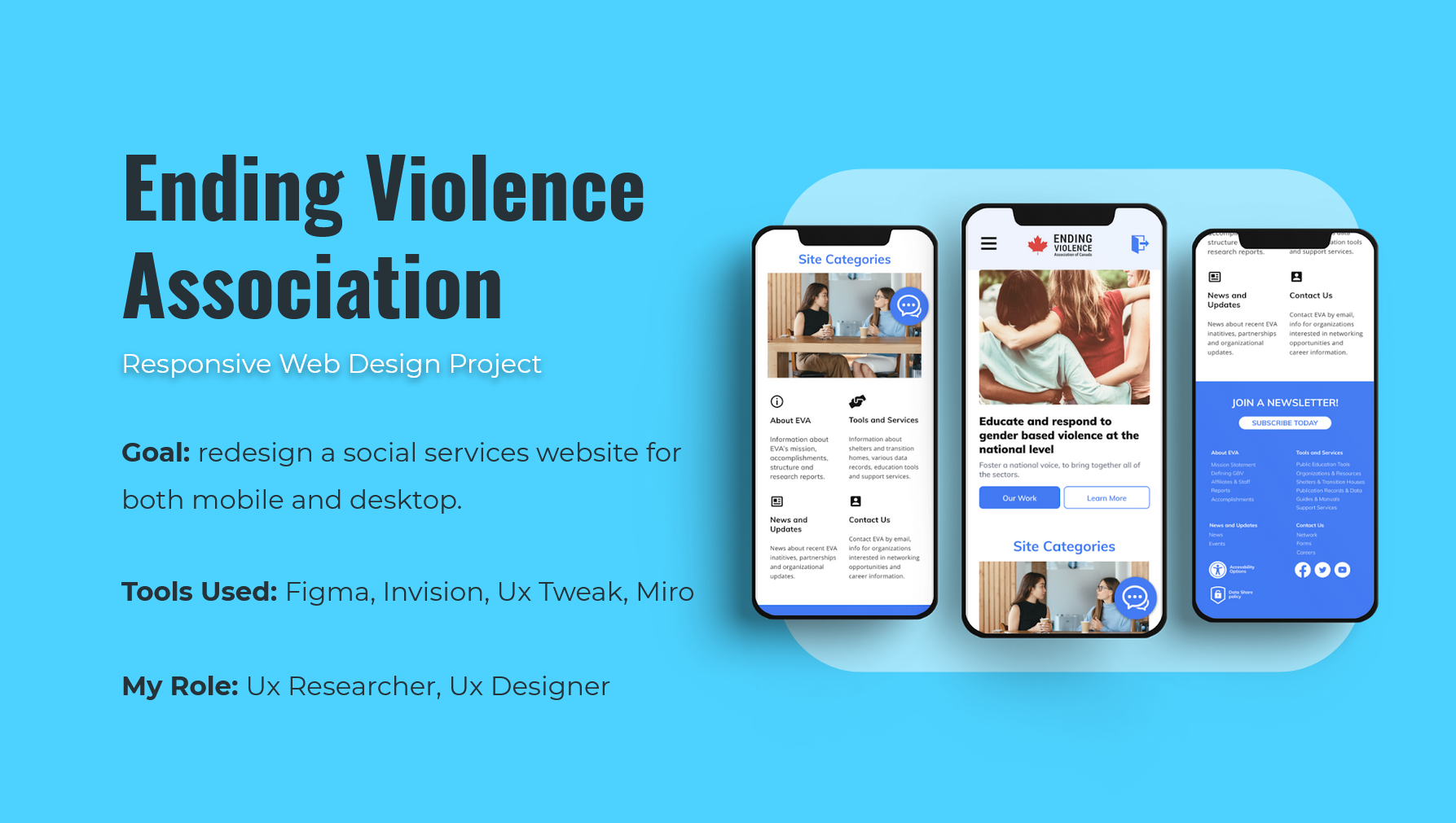
Project Breakdown
Goal:
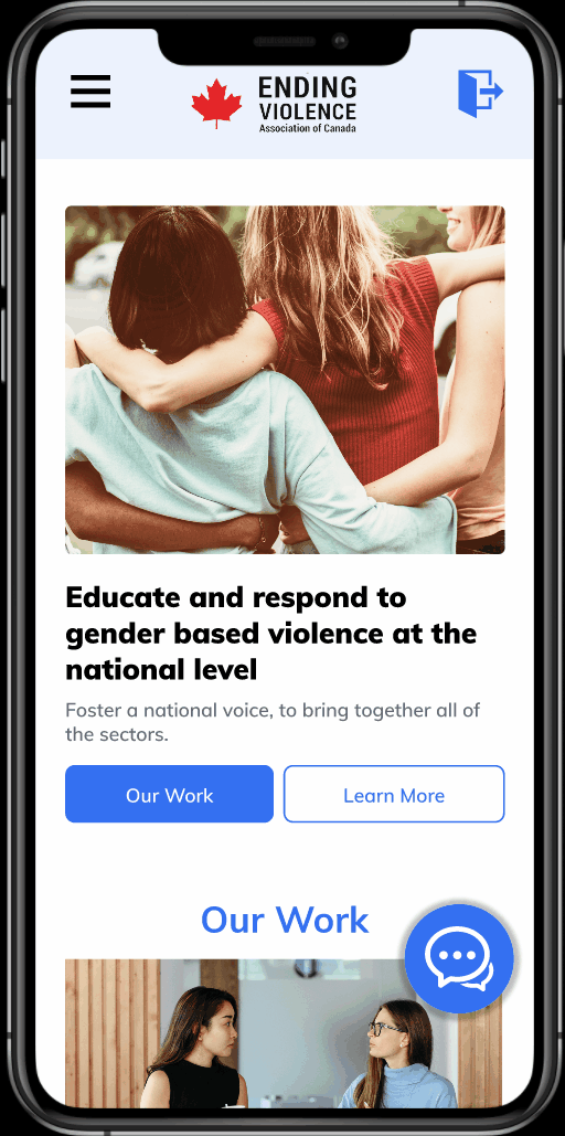
The Ending Violence Association of Canada is a non-direct social service website. Its purposes are to educate and respond to gender based violence at a national level.
My task was to redesign Ending Violence Association's website for both desktop and mobile formats. Focus was placed on improving usability by overhauling the content structure and providing more intuitive options to find resources.
My Role:
I worked with another UX Designer when designing visual components and when testing iterations for both the mobile and desktop versions of the EVA redesign.
The Solution
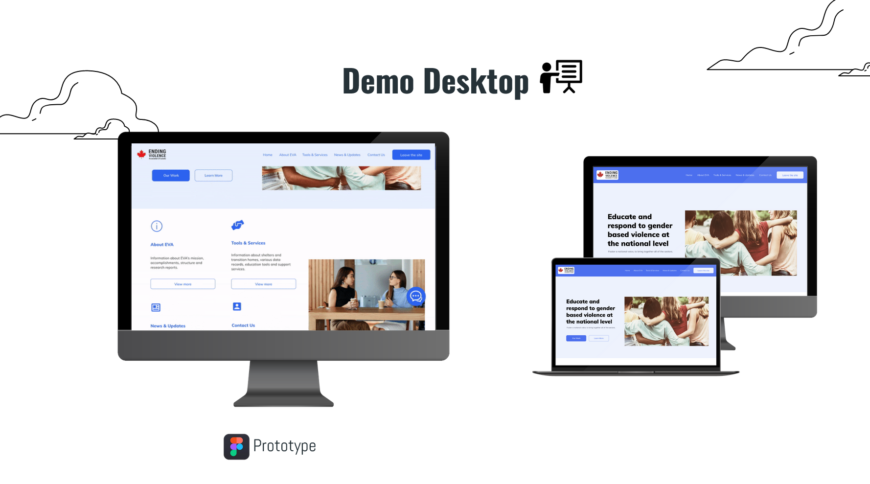
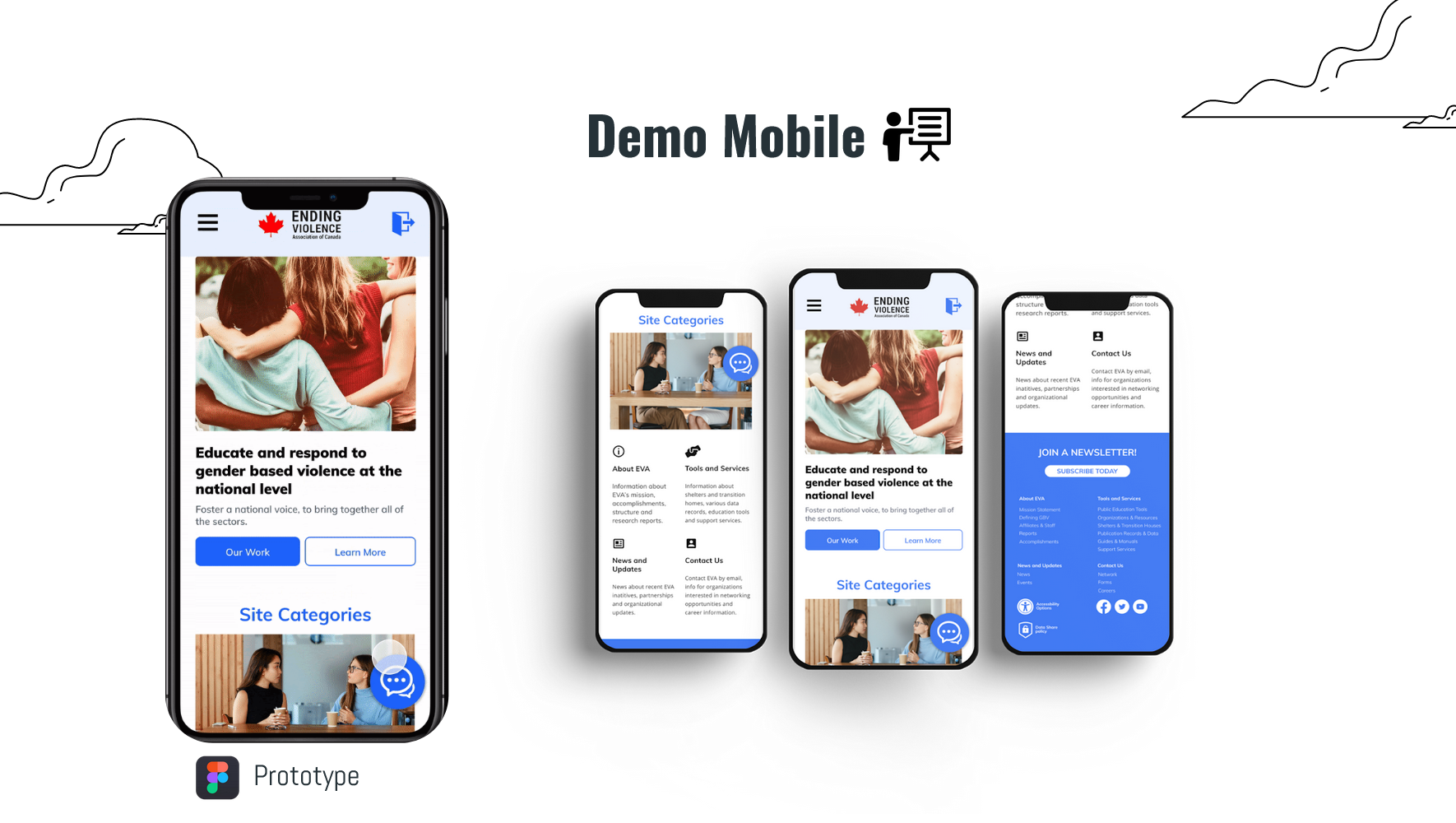
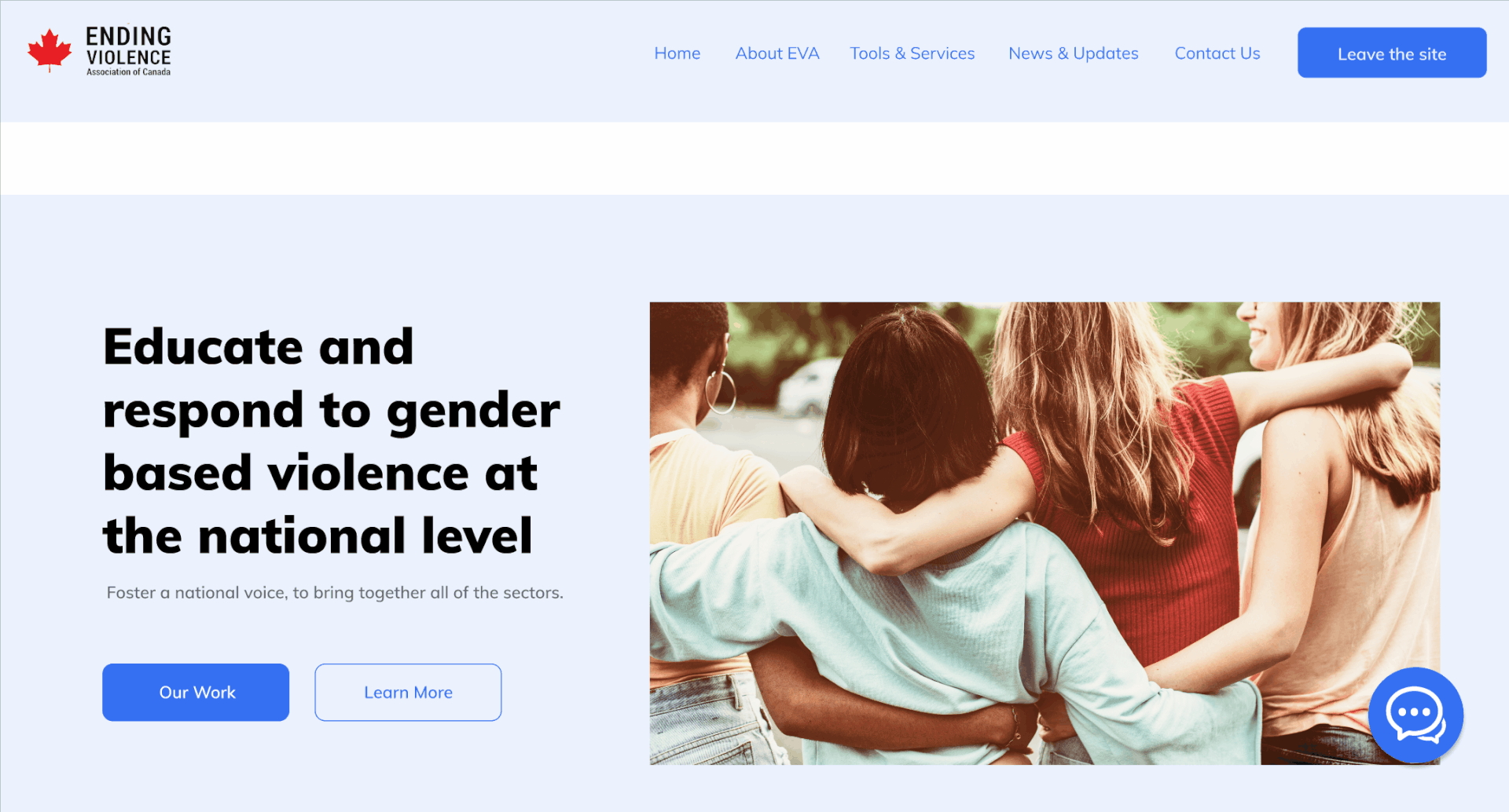
Following user testing we created and iterated upon various web and mobile prototypes.
With the final prototype we focused on providing clearer content organization and providing more upfront help options such as a newsletter and chat bot.
User Interactions Web
User Interactions Mobile
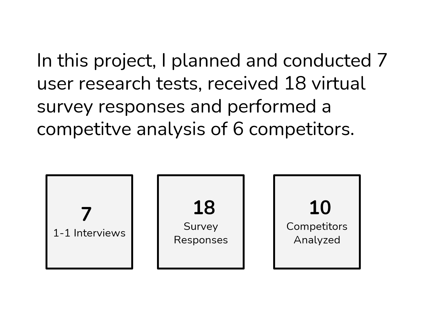
Research
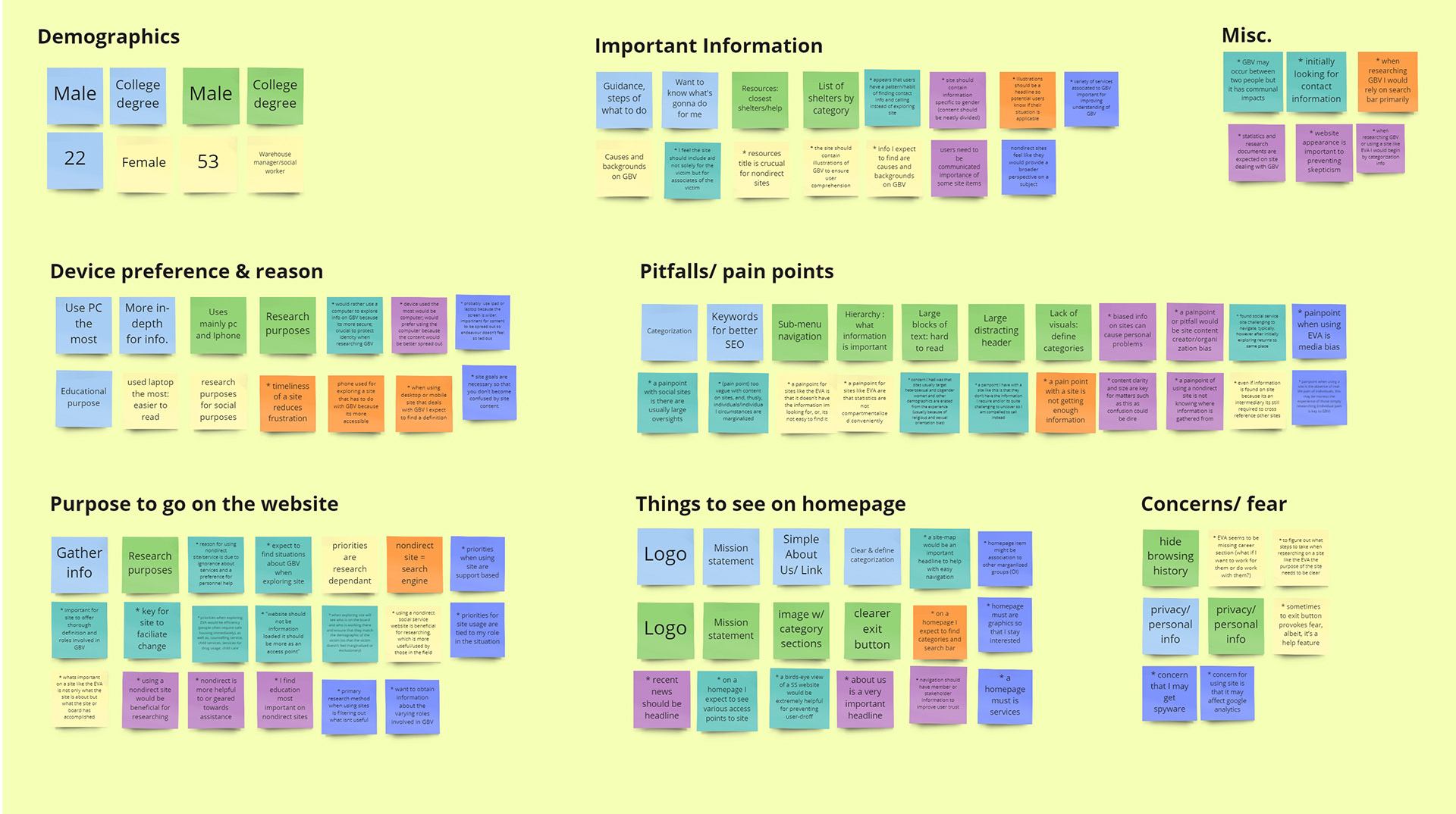
Initially a survey was sent out asking about social service websites and information preferences. A heuristic analysis, competitor analysis and user interviews were conducted to gain a better understanding of existing website issues.
From this research I learned that:
1. 55% of users found searching for help to be the biggest challenge on the existing EVA website.
2. Commonly expressed usability issues were poor content organization, unclear navigational menus, and unappealing visual layout which leads to people feeling disconnected from the site.
3. Mobile and desktop platforms are pretty evenly used among social service websites: 45 vs 55 %
Survey Data and Competitor Analysis
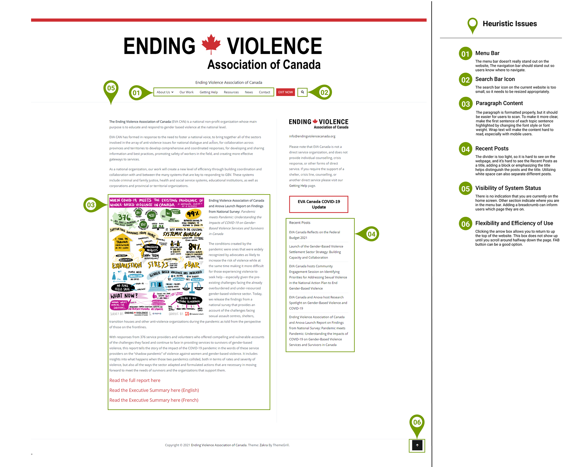
Heuristic Issues of the EVA homepage
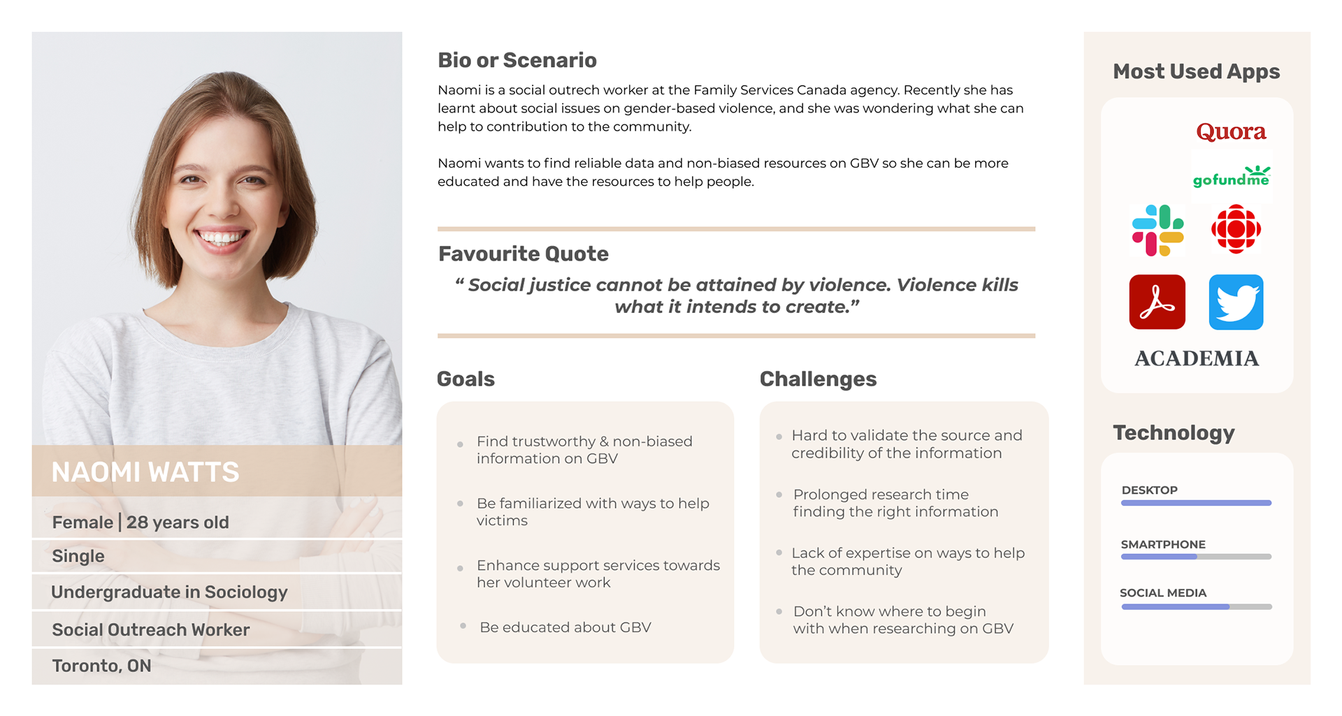
User Persona
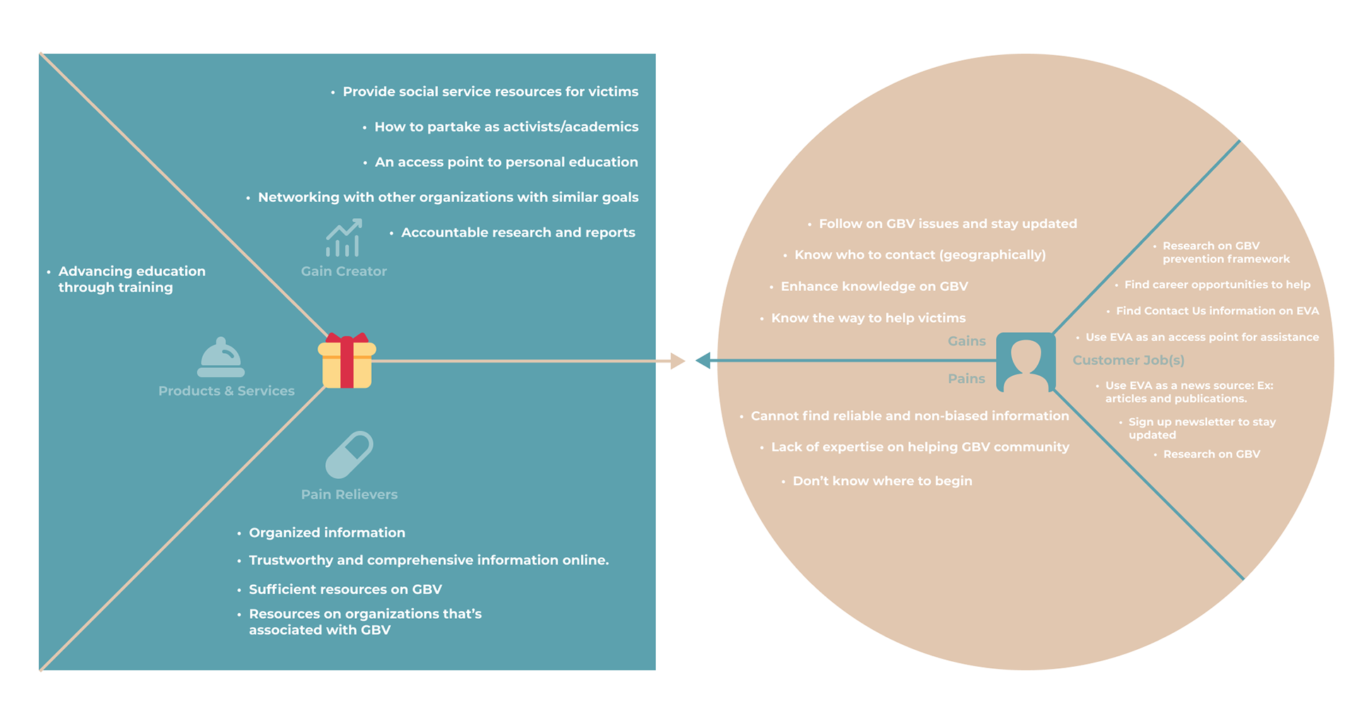
We based our user persona around an individual who is using the EVA website for research purposes. She wants to find reliable data about gender based violence so that she can better assist others as a social outreach worker at her Family Services Canada agency.
User Insight
Naomi needs to find a trustworthy website that has clear structure so she can research gender-based violence issues and be more educated in order to gather the right resources to help victims in her community through her research related work.
Problem Statement
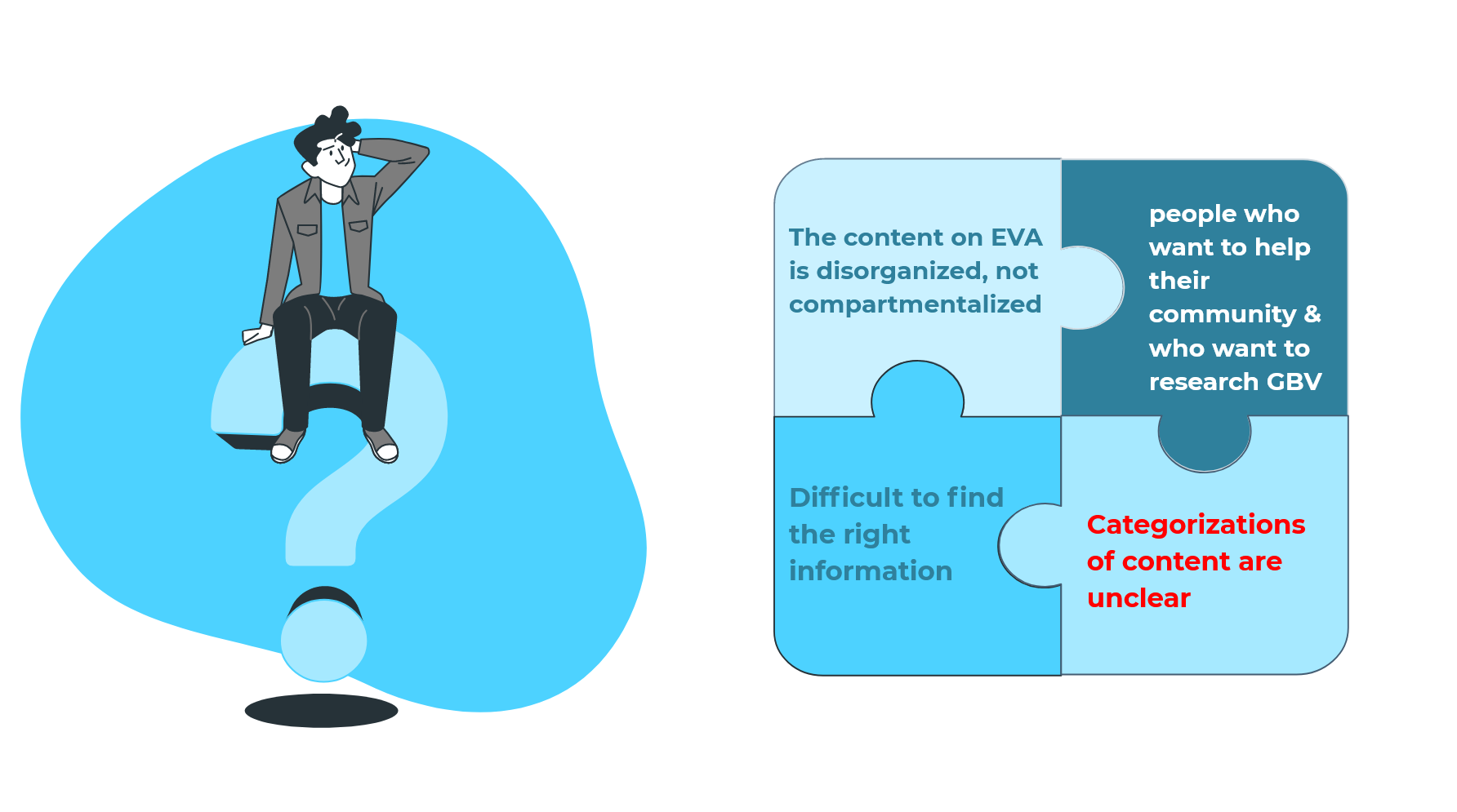
During our interview and survey, we discovered that most users found the content on EVA is disorganized, not compartmentalized, and it is very difficult to find the right information. Browsing the website is also frustrating to visitors, as the categorization of content is unclear.
We believe in a clear content categorization and defined structure of the website for people who want to help their community & who want to research Gender-based Violence and assistance resources will make the website easy to use and more efficient browsing experience.

Iteration
To get a better sense of content organization for the website card sorting was conducted with people within health organizations such as nurses and social workers. In this activity users were asked to sort menu content from the previous website into their preferred layout.
The responses aided in determining website categories and subsections for the website.
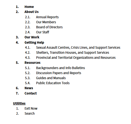
With the card sorting data we were able to develop a site map that simplifies the content categories and focuses on the tools and service resources that EVA provides.
Original EVA Content Categories
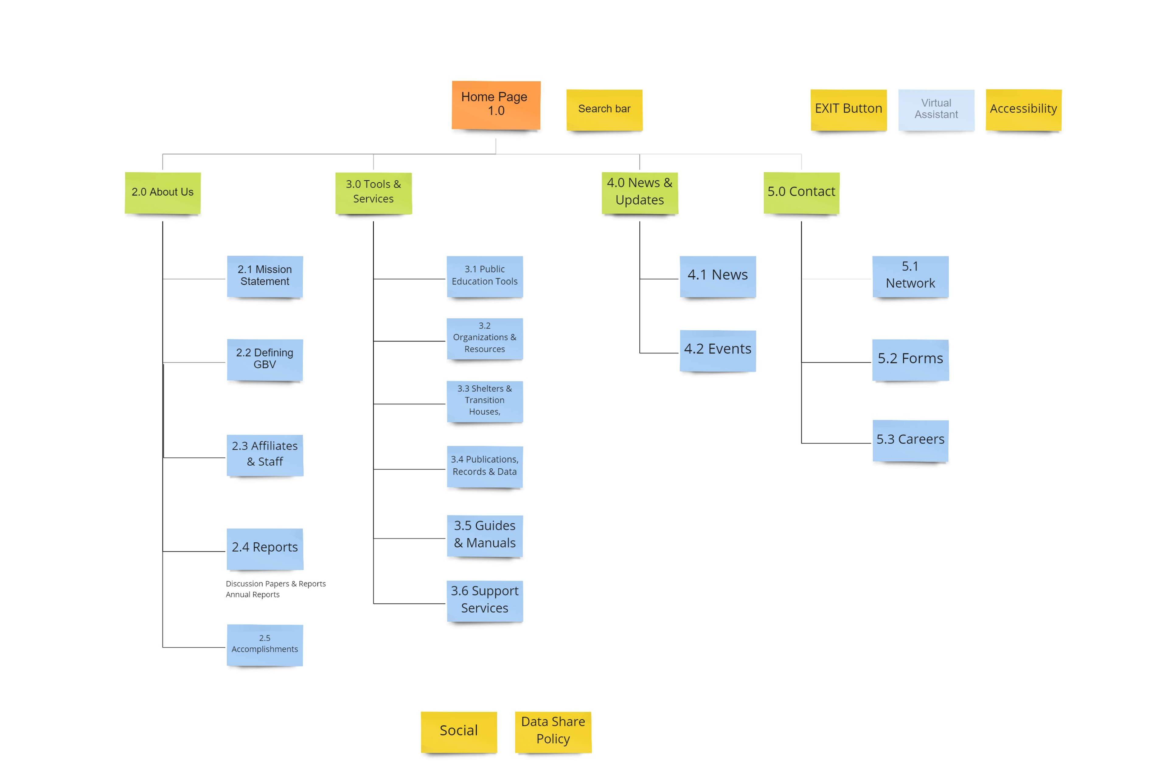
Updated Sitemap: 4 subcategories About Us, Tools, News, and a Contact Us page
Prototypes
The main issue with the previous website was poor content organization leading to an inability to find resources such as shelters or support service numbers.
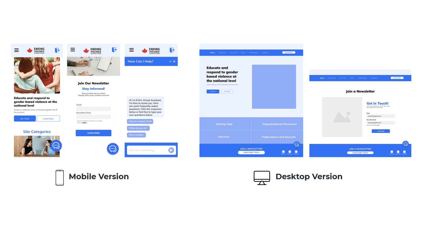
The prototypes developed were for signing up for a newsletter and a chat assistant that provides easy access to commonly requested resources. The goal with these prototypes was to provide upfront help options and provide a more welcoming experience for users.
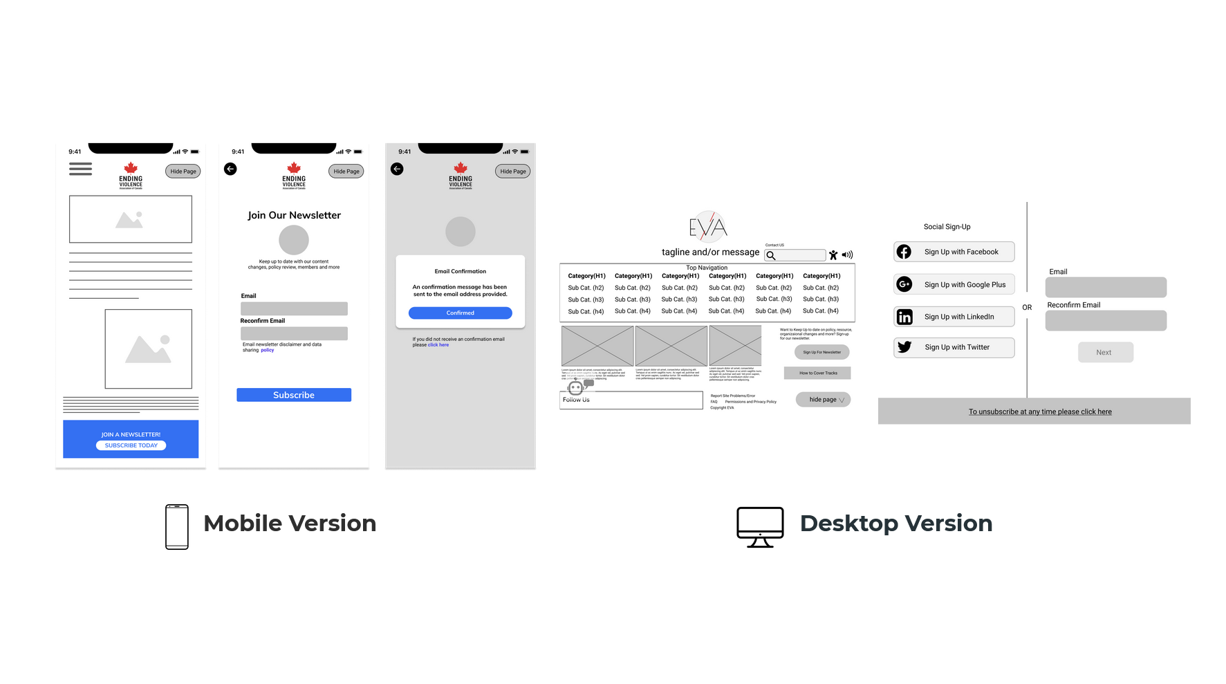
Prototype Iterations
User testing allowed for the navigational experience of signing up for a newsletter and the chat assistant to be refined.
For the newsletter the number of steps needed to sign up was reduced.
For the chat assistant the wording of the bot responses was changed to provide users with a clearer understanding of what the assistant does. Additionally some navigational options were rearranged to prevent users from accidentally closing the assistant window.
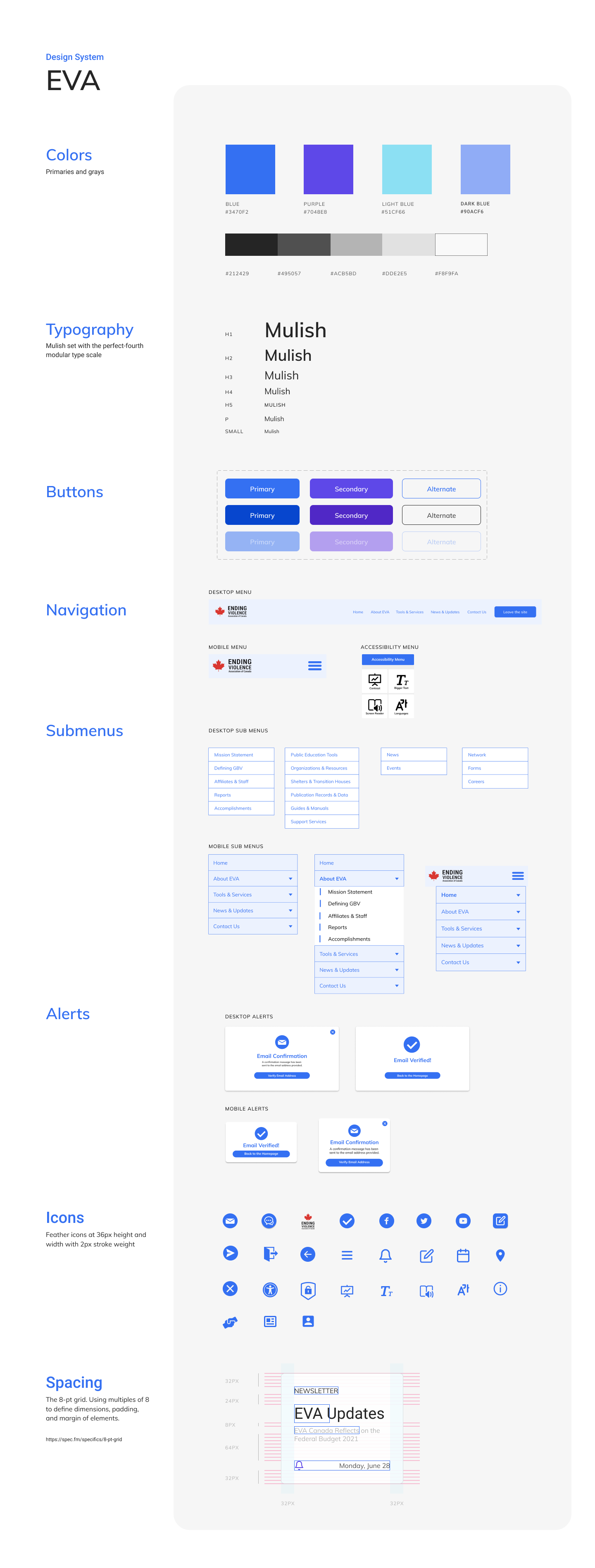
A style guide was created with an emphasis on blue colors and components to provide a calming experience for first time users.
Solution